Why a Great Hiking Trail is Like a Great Website or Web App
This post was inspired by a recent hike on one of my go-to trails: The Billy Goat Trail A along the Potomac River outside Washington, DC.
A good hiking trail is like a good website or web app. In this post, I am referring to hiking trails that are designed, marked and maintained by an organization (rather than ones that form naturally from use and without a supervising organization). The fundamental similarity between a good hiking trail and a good website or web app – the similarity that drives most of the observations below – is that both strive for an excellent User Experience (UX).
Usability
Usability is one factor that falls under the umbrella of user experience, and it gets at the pragmatic ability for users to complete tasks. A big part of usability in a website or web app is the flow or navigation, and this is where the analogy with the hiking trail begins. Just as a website aims to move its users through ‘funnels’ to conversion goals using calls-to-action and navigation bars and buttons, a hiking trail has blazes marking the path for its hikers to funnel through the trail, eventually reaching the exit. However, these trail blazes must strike a balance between a) being present enough to clearly show the direction of the trail and b) not infringing on the natural beauty of the area. To keep with the analogy, a site’s navigation details must guide users through the site efficiently but without being so obnoxious that they make for a cumbersome User Interface (UI).
As a side note, the Billy Goat Trail has excellent usability; its blue blazes can always be spotted simply by looking around, but they do not impose on the natural setting and are not on every tree or rock. Was this nice balance the result of Usability Testing by the trailblazers? Maybe.
Interface Design
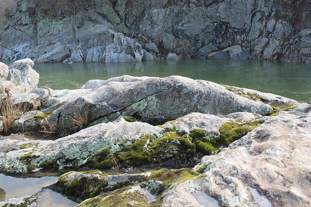
The usability of a site and a hiking trail gets at the ability for users to complete tasks (i.e. purchasing a product or completing a hike), but there is more to both environments than simply roadmaps for finishing. There are visual aspects to the design that add to the UX. On a website, this includes the layout and selection of fonts, colors, images, videos and even the copy used to provide more information.
The same goes for a hiking trail. The designers of the Billy Goat Trail could have made a straight hiking trail that stayed exactly 30 yards from the towpath of the C&O Canal – but that would be boring. Instead, the trail winds you through the forest until you reach the rocky cliffs over the Potomac River. From there, you go in and out of the woods to find amazing view after amazing view. These visuals add to your experience just as a website’s visuals add to the experience.
Speed
A website’s loading speed or its ability to handle traffic have a measurably large affect on user experience. Similarly, the speed of a hiking trail (traffic, not length) greatly affects the experience of its hikers. Being stuck behind crowds of people on the hiking trail not only makes it frustratingly slow, but it takes away from the natural beauty of the area.
—
For the sake of not forcing the analogy further, I’ll wrap up here. But, there are ways to continue the analogy (e.g. the error messages in a website are like the ‘Stay on Trail’ signs on a hiking trail; a sitemap is like a trail map). Ok, I promise I’ll stop now.
Photo by Vicky TGAW